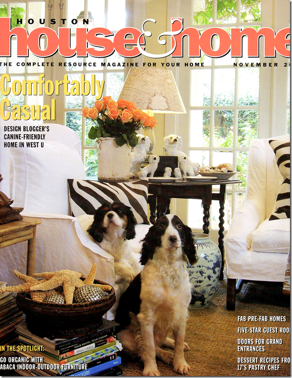
My first cover shot 2007: Georgie and Sammi Jo. Actually they wouldn’t sit for a picture together so two pictures of each dog were spliced together to make it look like they really love each other. They don’t. Now four years later, almost everything in this picture has changed except for the sofa and chair and lamp.
When I first started blogging, another blogger friend, Melissa from The Inspired Room HERE coined the word – coveritis – to describe the affliction of constantly fluffing one’s home to make it worthy of being on a magazine cover – at a moment’s notice. If you suffer from coveritis you have an irrational fear of your house not always looking good enough to make it into a design book. Symptoms of coveritis include keeping your house in a state of non-clutter: all papers, mail, toys, clothes and crafts are always put away immediately - just in case a stalking photostylist stops by unannounced. Remember, this is an irrational fear. To understand coveritis - imagine it like this – your house always looks like President Obama is on his way for dinner.
Now, the opposite of coveritis is being a coveritis-wannabe. You are a coveritis wannabe if you WANT your house to be photo ready at any given time, but it’s not and never will be. You never file away your bills fast enough and your children’s school work is always spread out over the dining room table. Your husband takes command of the coffee table and his random magazines and catalogues are center stage instead of your carefully arranged design books. Your bed is never made before 3:00 pm and more often than not, your bathrooms are littered with wet, used towels. Usually for a coveritis wannabe, the only room ever photo ready are the never used living room. As hard as you try and despite how much you wish it was, your house is just never quite ready for that photoshoot.
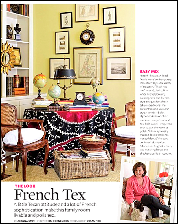
Three years ago, this story appeared in Better Homes and Gardens. Again, that corner of my family room has completely changed! (Thank God!!)
I am without a doubt a total coveritis wannabe. I’m always futzing around in my house, moving furniture, accessories, and books – trying to get it to look camera ready, but it never really is. The endless catalogues accumulate, packages are opened but linger around waiting for their final home, shoes never quite make it to the closet, and stuff just grows and multiplies like the octomom’s stomach. I have endured two actual photoshoots in the past few years, so I know what it means to have my house look camera ready – but, of course a professional stylist accomplished that feat for me. For both magazine stories, the stress level of whipping my house into cover-ready state was almost unbearable. In fact, I said, “never again” to another photoshoot. That was until Bonnie Broten, Regional Editor for Meredith Corporation, came to town this week and brought a film crew with her. The last few days were like college hellweek for me while the crew cheerfully took a few pictures of my kitchen for this magazine:
BHG’s Specialty Magazine – Kitchen and Bath Makeovers – done on a small budget. My kitchen certainly fits that criteria! The story won’t be in this magazine until Summer of 2012 – such a long wait.
Since I am a coveritis wannabe, I swore I would never again let a photographer into this house. It’s just too much – too much angst, too much cleaning up, way too much insecurity, just too, too much. Coveritis sufferers live for their house to be photographed, but for someone with clutter issues, it’s just not fun. This time, the pictures were taken only of my kitchen for the BHG specialty magazine – Kitchen and Bath Makeovers. Forget for a moment that I have no clue why they would even want to put my kitchen in the magazine, but why it’s on the cover is truly a mystery. My kitchen is no big deal. It’s got so many flaws and it’s so ordinary, I am at a loss as to why they were even here. I can name a million other kitchens right off the bat that are so much better and more deserving than mine. Like this one:
Sally Wheat’s kitchen has spawned dozens of copycats. I can’t tell you how many people have emailed me pictures of their own “Sally Wheat” kitchen.
Like this one, which was inspired by Sally Wheat. Homeowner Sara did such a great job – read the story HERE and HERE.
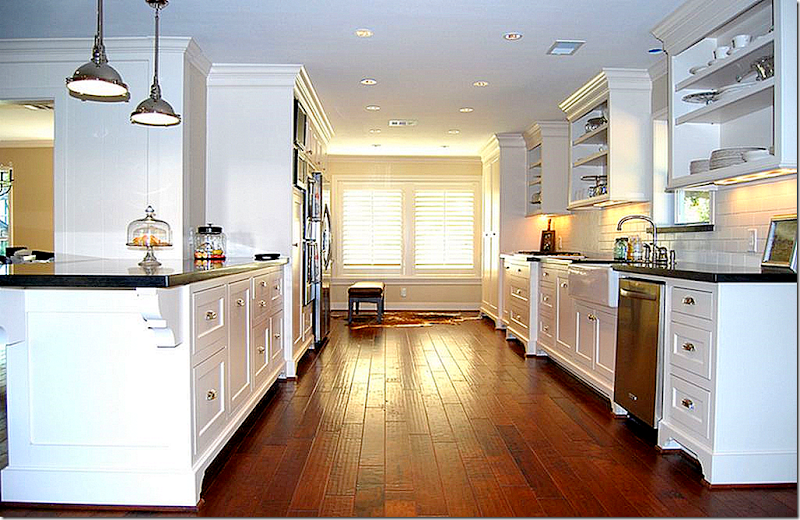
This kitchen in Houston was also inspired by Sally Wheat. Surely this remodeling deserves a magazine story. Read about it HERE.
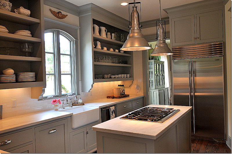
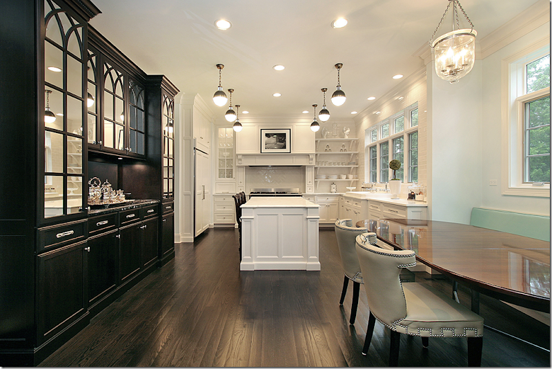
This Houston kitchen, NOT inspired by Sally Wheat (finally!), is very magazine worthy! A beauty in gray and white marble and black granite, it was designed by Julie Dodson – read the story HERE.
Remember this stunning kitchen in black and white? The homeowner designer in Deerfield, Illinois sent in her pictures. Surely this is more magazine worthy! Read the story, HERE
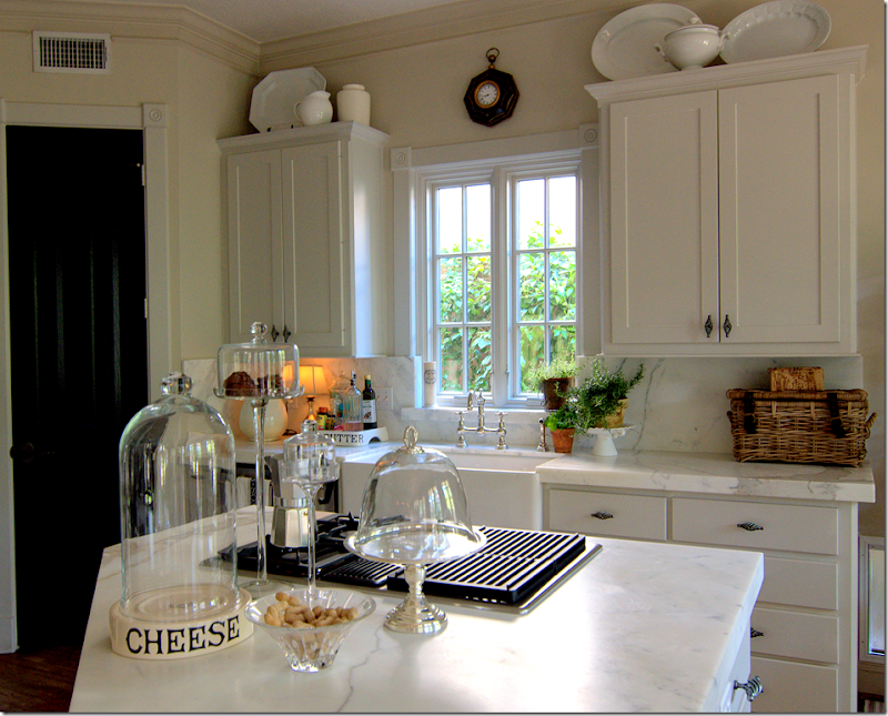
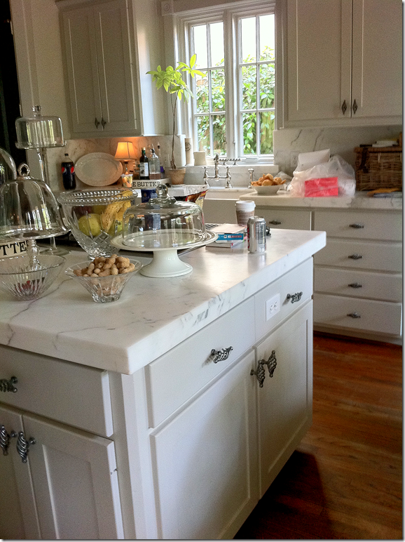
And then there’s this. It’s almost embarrassing to show, but here is my kitchen. Now, keep in mind that since I am a coveritis wannabe, my kitchen is usually not this neat. I edited it for these pictures.
Here’s how it actually looked the day before the photographers arrived.
Edited picture that I took. Veddy neat, but so not reality.
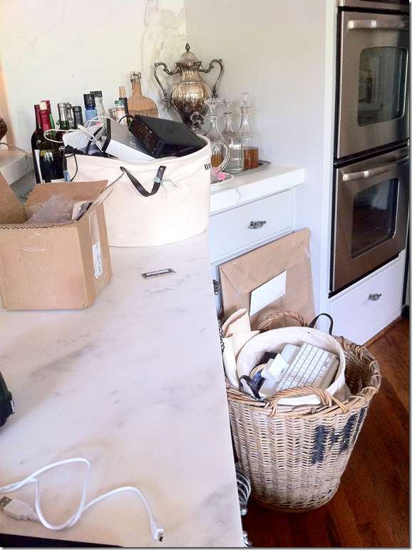
And in this little corner, I certainly edited the space to take these pictures.
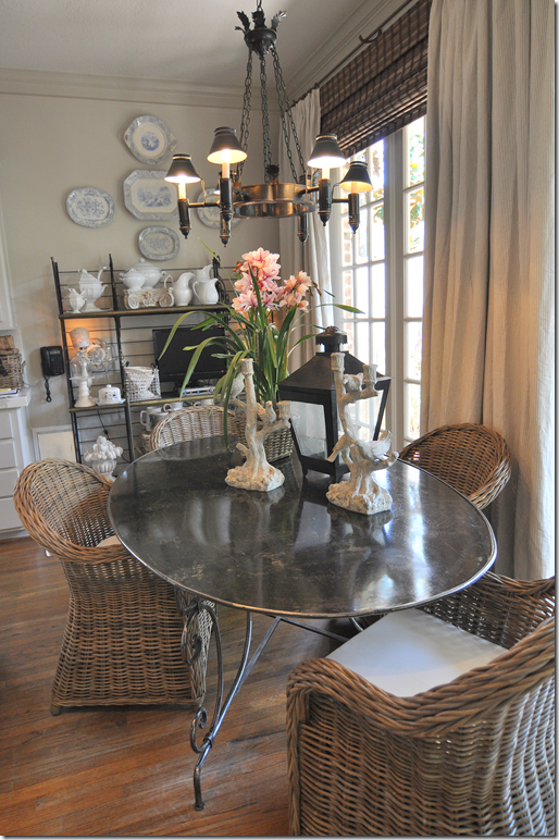
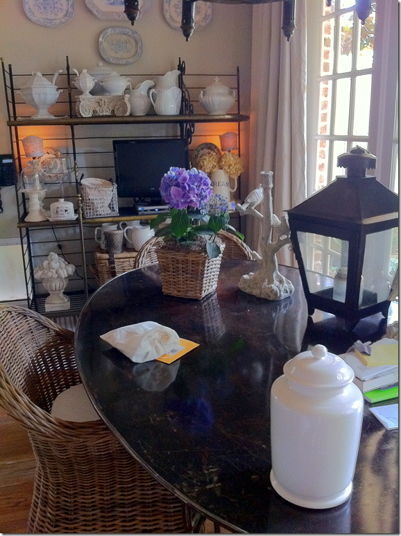
Here’s what it looked like the day before the photoshoot.
Cleaned up for pictures.
Not so tidy in real life. Before the crew arrived, I had to move the TV, the water cooler, the boxes, the files, the baskets, the lantern, the cloches – all went into the garage.
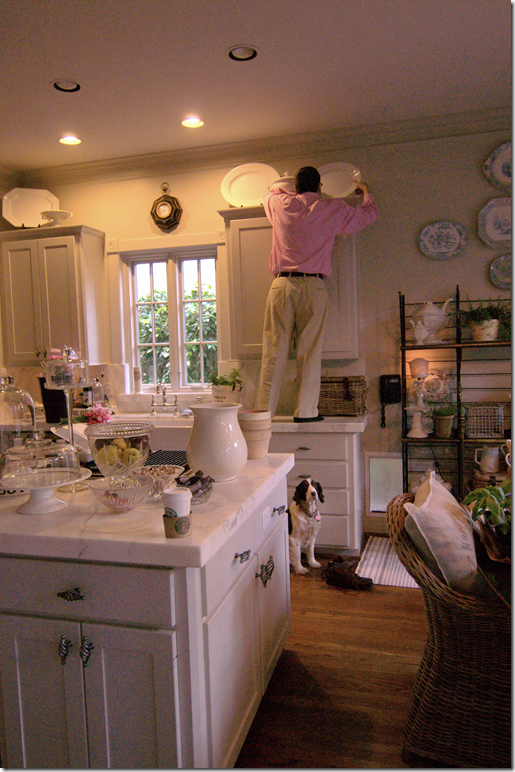
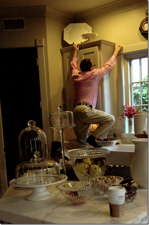
The day before the shoot – the crew came by and we started editing even more. Ben was enlisted to move the ironstone around.
He wasn’t too happy about the photoshoot to begin with, much less helping out, but almost falling off the counter was the last straw for him.
The day of the photoshoot was extremely long for me and the dogs. We are used to extreme quiet during in the day. It took three hours just to shoot one picture – the cover shot. The mess was terrible. Everything from my kitchen ended up in the family room.
Photoshoots are so high tech. The cover shot was approved via internet. Digital photography is amazing – each shot was extensively studied on the computer to ensure its perfection before going on to the next one. The talented Bill Bolin from Bill Bolin Photography HERE was super nice and helpful.
A huge surprise for me was that the art director wanted the old chairs resurrected from the garage – a mixture of both the new Kooboo chairs and the French chairs were used at the breakfast table. I wish I could show you how good the pictures looked! It was amazing how much better the experts made this small space look.
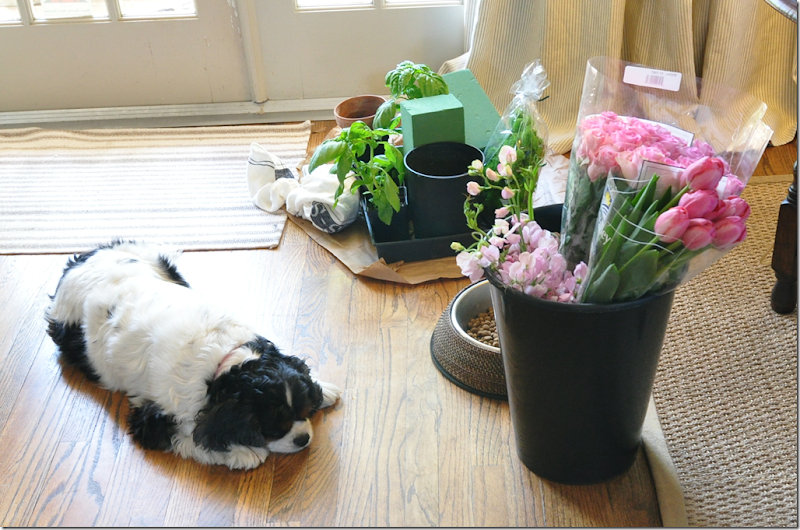
The best part were all the flowers and herbs. Sammie Jo couldn’t be bothered. She’s sooo cute! Stone deaf, but adorable.
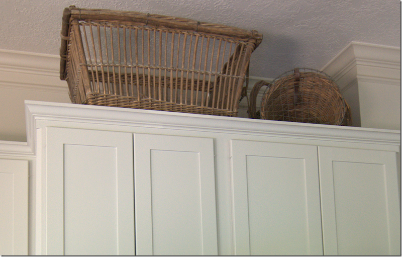
You have to have thick skin when you invite a team of photostylists into your home. The head honcho directed that my baskets come down from above a bank of cabinets. Well…how DARE he??!!!! The large chicken coop basket?? was bought at Joyce Horn Antiques HERE about 15 years ago. Each year my parents gift Ben and I with a check for our anniversary and that year I took the check and bought the only thing at Joyce’s that I could afford – that basket! The other basket is a small antique pet carrier which I love. After the baskets were taken down, I had to admit I liked it better without them, so into the garage they both went – I’m not putting them back out. My garage is such a wasteland.
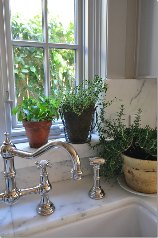
When it was all over and my kitchen was put back together, I got to keep all the herbs. I love them – they are so fragrant.
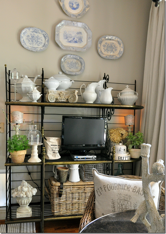
The TV came back out from the garage (which I hate, but my family insists we have one in that room.) The herbs add a nice touch of greenery to the bakers rack. One change that I made for the photoshoot was the pillows from Restoration Hardware which were added to the wicker chairs.
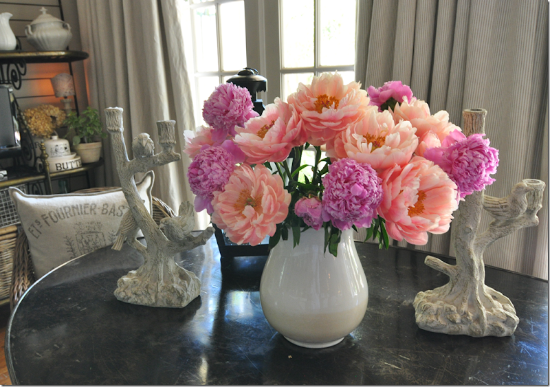
But, the best item left over were the glorious peonies! Aren’t they gorgeous? All in all, despite all the hard work, the photoshoot was a great experience. The photographer couldn’t have been nicer and the stylist Bonnie, one of the best in the business, was very helpful – making me see my kitchen through different eyes. Since I am a die hard coveritis wannabe, a few days later the kitchen was back to looking cluttered and messy, as usual. The story won’t be out until the summer of 2012! Such a long time to wait.
I would love to do a survey – are you a coveritis sufferer or a coveritis wannabe? I wonder which affliction would win???? AND, if you think you have a house or kitchen that is magazine worthy, send me the pictures and I’ll forward them to Bonnie. She’s always looking for new stories to pitch.
A huge thank you to Bonnie, Blaire, and Bill!!!!
AND, NOW FINALLY:
I’ve been so fortunate to host a large amount of giveaways. The gifts have been wonderful – vendors have donated jewelry, antiques, custom paintings, hotel rooms, and even very pricey chandeliers. It’s been great fun to run these contests and I’ve loved that so many of you have won something great. While I usually am on the giving side, I was shocked to hear that I had won a giveaway from another blogger -
.
And no, that’s not me. Snort. That’s a model from from Manito’s web site.
I won this beautiful silk robe made by Manito Luxury Silk & Linen HERE. The giveaway was hosted by Brillante Interiors blog, written by Renaissance woman, Albarosa Simonetti. If you have never visited her blog, do so HERE – she writes about interior design and travel – all with an Italian beat! Thanks a million Albarosa!!!
Sunday, May 29, 2011
Coveritis Wannabe
Wednesday, May 25, 2011
Fabulous ANTIQUE Giveaway With Two Winners!!
A vintage postcard from the Shamrock in Houston
Every city has a hotel that was once the center of the glittering social set. In Houston, that hotel would have to be the Shamrock, later called the Shamrock Hilton. It opened on St. Patrick’s Day, 1949 to a packed crowd of Hollywood celebrities and Houston elite. Life Magazine put the event on its cover. For decades, Houstonians flocked to its Cork Club for entertainment and the Emerald Room for lavish weddings. Built by a famous oil wildcatter, Glenn McCarthy, the hotel’s theme was green, from the bellhop’s uniforms to the rooms décor.
The Corkettes – The Shamrock’s synchronized swimming team
While Houston adults played inside the hotel, the baby boomers played outdoors in the vast swimming pool – said to be the largest pool in the world, though never proved, of course. Prized summertime memberships were available for use of the pool. The Corkettes were a nationally famous synchronized swimming team that were sponsored by the Shamrock. For some unknown reason, I was a Corkette one memorable summer, mostly coming in last place during competition - though once I came in next to last! My team did win a third place medal one time, though there were only 3 teams competing, a fact I was too humiliated to tell my parents. The recession that Houston suffered during the 80s was the death knell for the hotel, though, it was on the decline for quite a while. The doors were finally closed and the building was demolished in 1987 – a huge symbol to Houstonians of time marching by. There was an auction selling all the goods, including the hotel silver and plates. You can still find Shamrock hotel silver for sale on the internet:
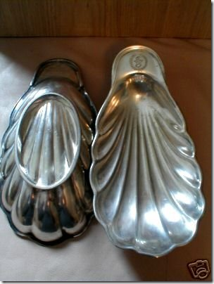
Two shelled butter pat holders with the Shamrock emblem were sold recently.
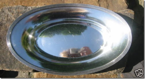
A bowl from the Shamrock that was recently on the market.
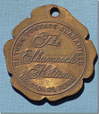
And this early room key attachment – remember if you accidently took the key home, free postage back to the hotel was guaranteed?
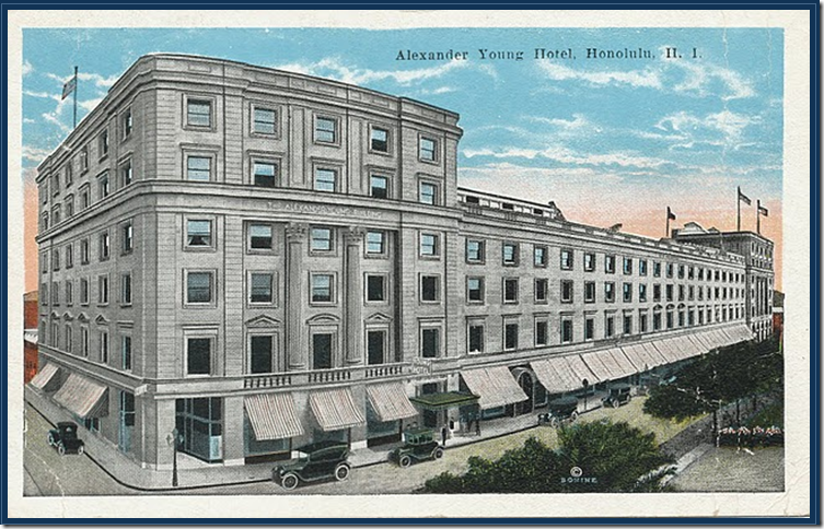
While the Shamrock was the most famous hotel in Houston, if you lived in Honolulu, you might have memories of the Alexander Young Hotel, built in 1901 by Alexander Young a Scottish born Honolulu businessman who make a fortune in sugar mills and iron. The Young had 300 rooms – but surprisingly it was built down town and not on the beach, something that wouldn’t be done today. After purchasing other hotels, Andrew Young became known as the father of the hotel industry in Hawaii. The United States army used the building during war times and its death knell came when the hotel was turned into offices. It was finally demolished in 1981. Here is how the hotel was advertised shortly after its opening:
It has a roof garden one-third of an acre in extent where refreshments are served and concerts given at intervals, and from which a fine view of the city may be had. At either end of this roof garden is a dance pavilion. The hotel, built in 1900, is fireproof and thoroughly modern, modelled after mainland city hotels. It accommodates 300 guests, and is conducted on the European plan: $2 per day upward.” —The Aloha Guide, 1915.
Wow. $2.00 a day! Amazing! And notice the “fine view” is of the city, not the beach!!
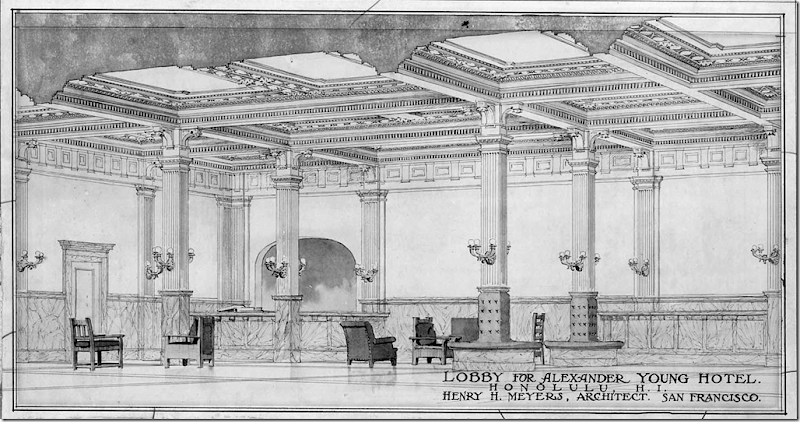
An original architectural drawing of the lobby.
The famous roof garden.
A photograph of the roof garden.
So, I know you are anxious to know, but what is the giveaway?????????
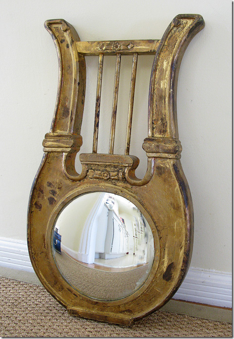
Remember this beautiful antique mirror that was a giveaway last year?
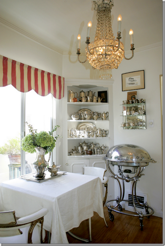
The mirror was a gift from Paris Hotel Boutique, an online shop filled with the most interesting antique and vintage items! Paris Hotel Boutique is owned by Lynn Goldfinger who loves to collect hotel silver from famous places like The Shamrock and the Alexander Young. Lynn has a personal collection of hotel silver rivaled by none:
Lynn’s breakfast room, shown here, has a portion of her large collection of hotel silver. Amazing!!!! Read all about my story on Lynn and the Paris Hotel Boutique HERE.
THE GIVEAWAYS:
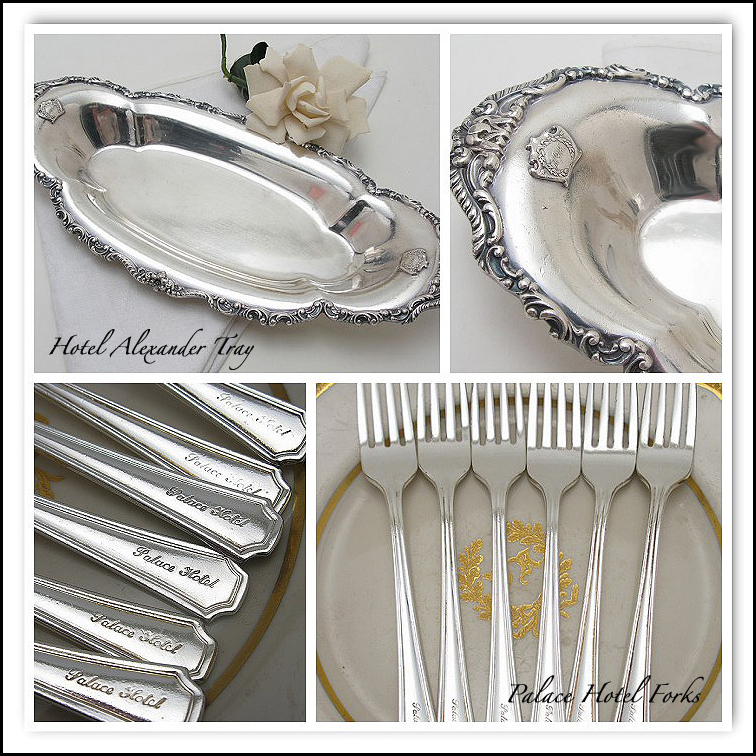
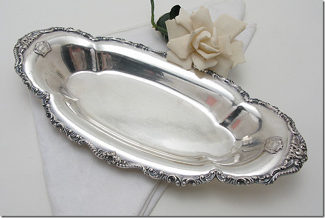
For today’s giveaway – we will have TWO winners! One will win the hotel silver tray from the Alexander Young Hotel and another will win the set of forks from the Alexander Young Hotel! Here are the descriptions of the two prizes:
Rare Early 1900's Alexander Young Hotel, Hawaii Serving Tray
Stunning early 1900's serving dish from the Alexander Young Hotel, which was located in Honolulu, Hawaii. This tray comes from a collection of pieces Lynn purchased from the hotel. This tray is quite ornate with a double raised logo on both sides, and a very fancy rim. It measures 12-1/2" long, 5-1/2" wide and sits 1-1/2" tall. The condition is amazing, with a bright, shiny patina. It is manufactured by Reed & Barton, with the hotel's name on the underside. There is no date mark, but presumably from the earlier part of the 20th century. This could be used for serving small dishes such as asparagus, celery, sweets and more. A stunning piece!
Set of 6 Palace Hotel, S.F. Forks
Set of 6 dinner forks from the legendary Palace Hotel in downtown San Francisco. Each fork is engraved, "Palace Hotel" on the handle. They measure 7-1/4" long. Lovely condition with little use. Manufactured by Oneida. This pattern was used for several years. These pieces aren't of early vintage, but most likely date to the 1960's or 70's.
HOW DO YOU ENTER THE CONTEST?????
All you have to do is go visit the Paris Hotel Boutique at www.parishotelboutique.com and look around. Pick out one item you would buy, if money was no object. Come back here and leave a comment telling me which item you picked. That’s all!!!!
You have until Saturday night at 11:59 to enter. I will pick the two winners then by using the random integer number on the internet.
If you post anonymously – be SURE you leave your email address!!!! Otherwise you can’t win!!!!!!! Very important!
A huge thank you to Lynn Goldfinger for hosting such a wonderful giveaway. Thank you, Lynn, for everything!!!!!
Saturday, May 14, 2011
A Tale of Two Houses (by the same designer and architect)
Bingo. Looking at HAR this week I got a lucky hit. A lucky hit is where everything just comes together – wonderful architecture, beautiful interior design, lots of French antiques, and just a bit of a mystery to drive me INSANE!!! A lucky hit like this is very rare and hardly ever happens which makes it all the more special. So…here’s the story. Get your coffee, pull up a chair, and sit back. It’s a little wonderful and a little bit crazy. Here goes:
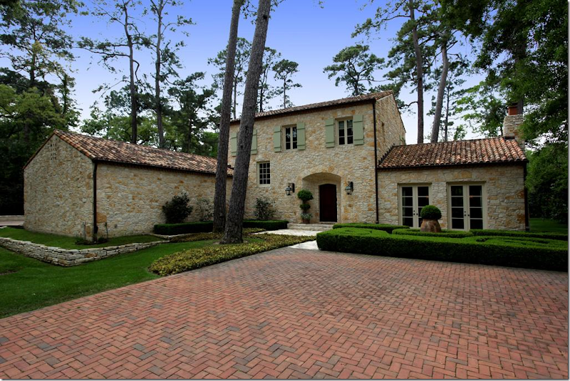
Wow. This gorgeous house caught me eye. I had been surfing HAR for a few days looking for anything interesting, and of course, nothing for sale right now is interesting, at all – just a bunch of oversized, poorly designed houses filled with poufy leather sofas and, well….shivers. What a waste of time. Just as I was about to give up, this beauty pops up. Whoa. Is this Houston??? Of course it is, the towering pine trees give it away, but take those pine trees out and insert plane trees, and it could be Provence or Majorca. I’m loving the exterior with the authentic green shutters, tile roof, limestone walls. Just gorgeous. There is just no way the inside is going to be great, right? I couldn’t be that lucky, could I?
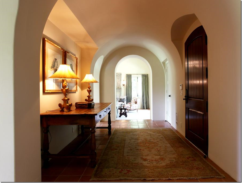
Wrong. Inside, things are starting to look very good. Great lamps and prints are in the entrance hall, with its beautiful ceiling and arched doorways.
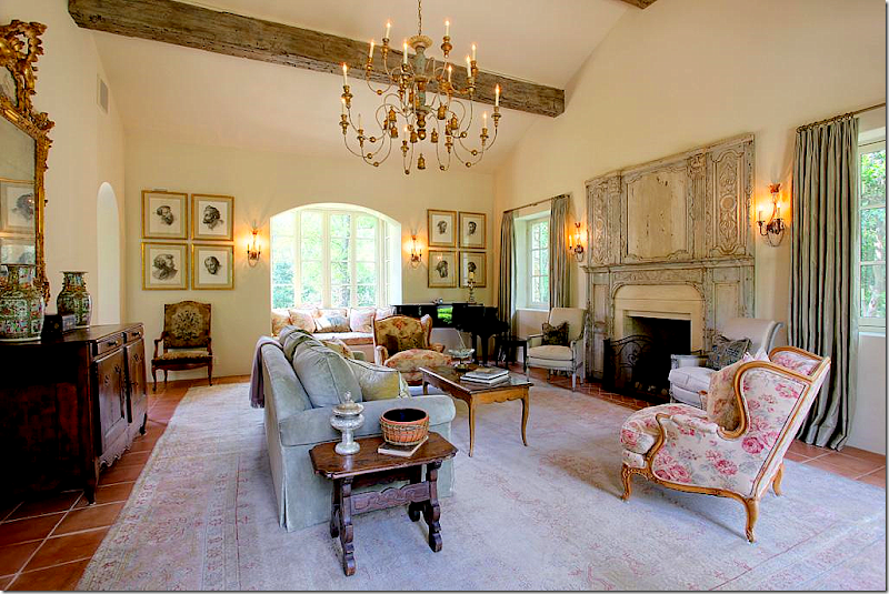
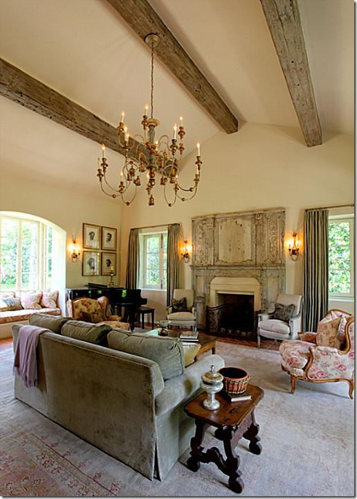
The living room is filled with French antiques, a large muted rug, and an unusual trumeau – dating from the 1700s. The chandelier is divine. Something about this room seems familiar and I just can’t place it. I know I’ve never seen this house before…but still, it seems like I have. I notice the Kenneth Turner candle on the side table – the one in the terra cotta bowl with its wicker sleeve that’s been discontinued. It makes me smile and think of Carol Glasser for a brief moment. And then…those prints on the back wall remind me of her too, for some reason.
Another view of the fireplace with the antique trumeau.
The dining room is beautiful – the walls and ceiling are a work of art. The chairs and table are so pretty and unique. And no seagrass – instead another faded antique Oushak rug sits underfoot. My eye goes to the large collection of creamware and the utterly gorgeous chandelier. Someone has exquisite taste, very, very exquisite taste.
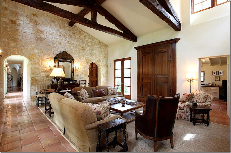
The family room is comfortably furnished, with Bennison printed fabric. I love that pattern and even once used it for my dining room skirted table. The TV is hidden behind 18th century Armoire doors that are mounted on the walls. The mirror on the stone wall is incredible. I’m loving all the small, Spanish style side tables and that chair! Notice on the left, down the hall, the gates with the staircase behind it. To the right through the arch is the kitchen/breakfast room. And at the right of this picture is the study/office.
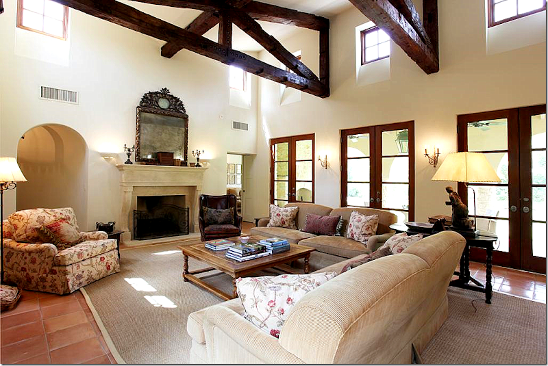
And looking the other direction, towards the fireplace with its limestone mantle. Another stunning mirror. In this room, seagrass makes an appearance. This is Houston, after all. The master bedroom is off to the left of the fireplace and the playroom is to the right.
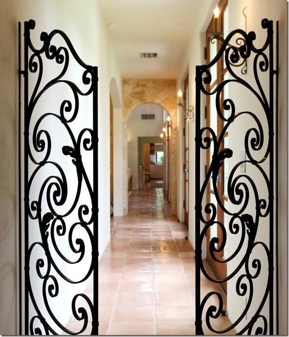
From the entry hall and the staircase, these iron gates lead to the family room and through to the playroom. The arch on the left is the breakfast room and the kitchen.
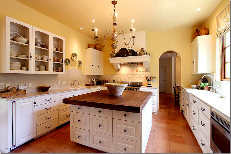
The kitchen has wire fronted cabinets. Notice the curved travertine backsplash behind the sink on the left side. A farm sink is on the right side. The island top is cypress wood. Through the arch is a kitchen desk area which leads to both the foyer and stair hall and to the mud room and garage.
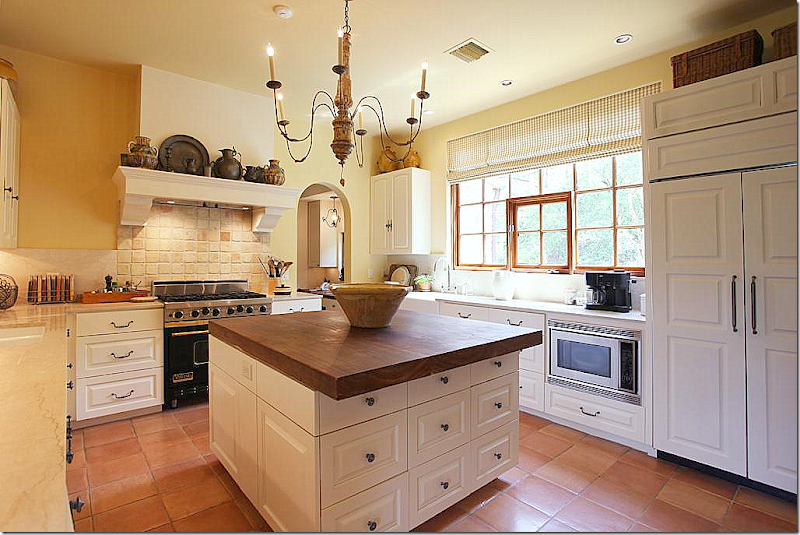
Another view of the kitchen with its charming range hood that resembles a fireplace mantel. The chandelier is perfect for the space.
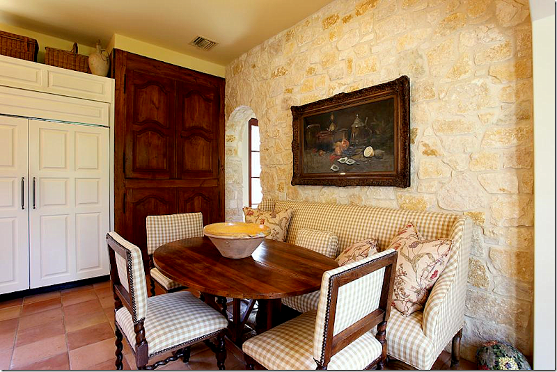
At the end of the kitchen is the breakfast area with its Austin limestone wall. The pantry is hidden behind 18th century Armoire doors that are fitted into the wall. I love the check fabric with more of the Bennison fabric that is found in the adjoining family room. Beautiful antique chairs, sofa, and French wine tasting table.
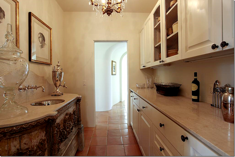
Between the foyer and the kitchen office is the wet bar. Just look at the antique cabinet with its inset polished nickel sink and curved travertine backsplash. Beyond gorgeous! The arched hallway leads to the front dining room and living room.
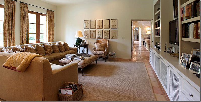
The playroom, off the family room has a large sectional. The antique styled ottoman and French chair, along with the gate leg table add warmth to the room, as do the curtains and the collection of botanicals.
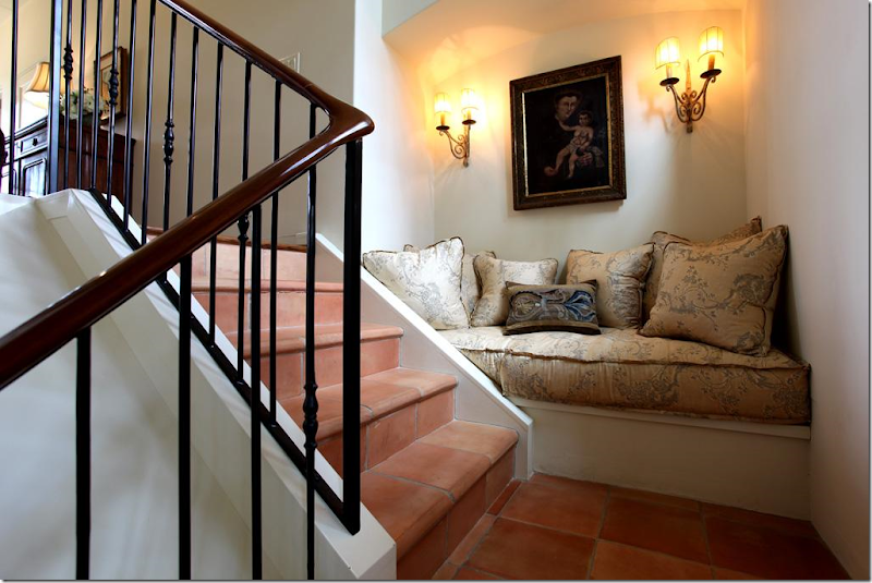
Up this stairs, on the landing, this vignette sends off signals to me. Where have I seen this before? I KNOW I have, but where? The house is starting to get under my skin.
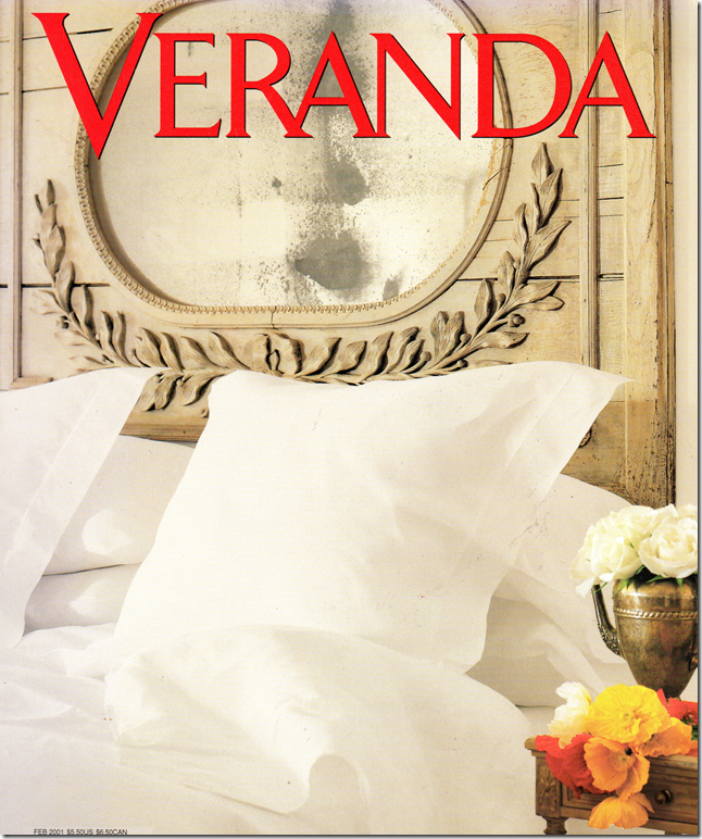
It’s this picture that starts the bells really ringing loudly. Call me crazy, but I KNOW that mirror! I could swear on my child’s life that this mirror was on the cover of a Veranda years and years ago. It was over a bed in a house that was once my favorite house ever. I know this isn’t the same house, but it seems so similar. It’s all coming together. That chaise with its distinctive arms – it’s familiar too. At this point, I have to go do research, which means digging through piles of old Veranda’s to find the magazine with that mirror on its cover. It doesn’t take me long before I have it in my hands. And yes, it’s the same mirror – exactly. So is the chaise. So are a lot of things that have seemed familiar. Does anyone remember that cover, that story?
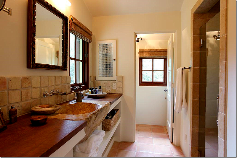
That sink! This is the man’s side of the master bathroom.
The woman’s side. Love the tub and the mirror – gorgeous!! And notice the triple vanity mirror – sooo great.
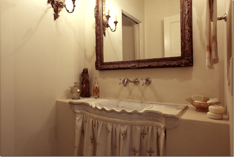
Charming powder room – just charming.
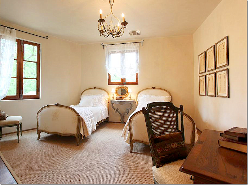
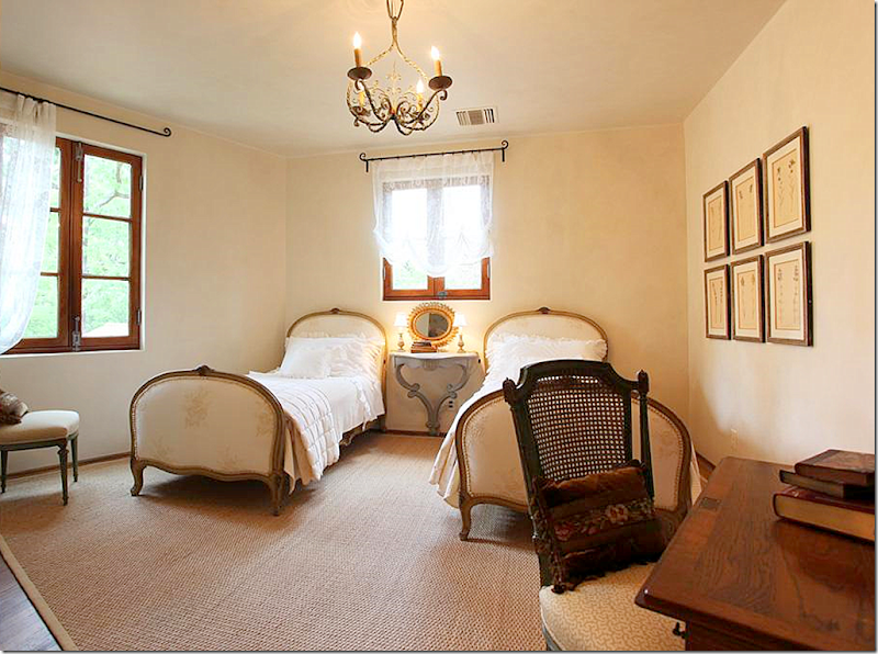
The guest room – I could move right in. Those beds are wonderful. And notice the hanging console between them. All the windows and the hardware are incredible = mahogany wood throughout.
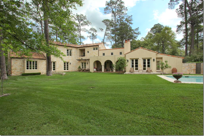
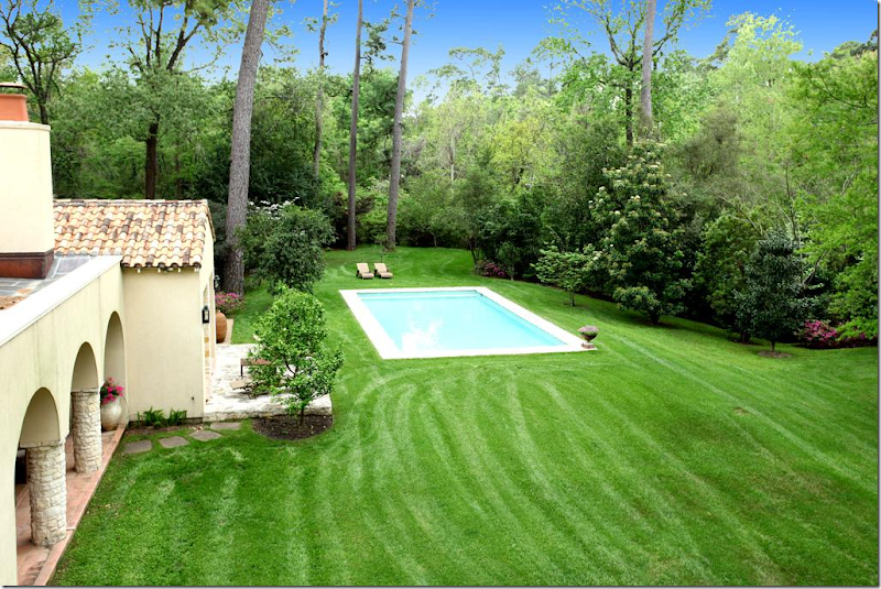
The back of the house – to the left is is the living room, then the dining room, then the kitchen and family room, which is behind the covered terrace, then the playroom, with the master bedroom in front of it. I like how they sited the pool off to the right of the house, away from it. It’s more European that way.
A view from behind the pool.
And here, you can see how isolated the pool is and just how utterly beautiful the property is. It’s located on one of the most isolated streets in a very small but terribly exclusive neighborhood more country living than city living.
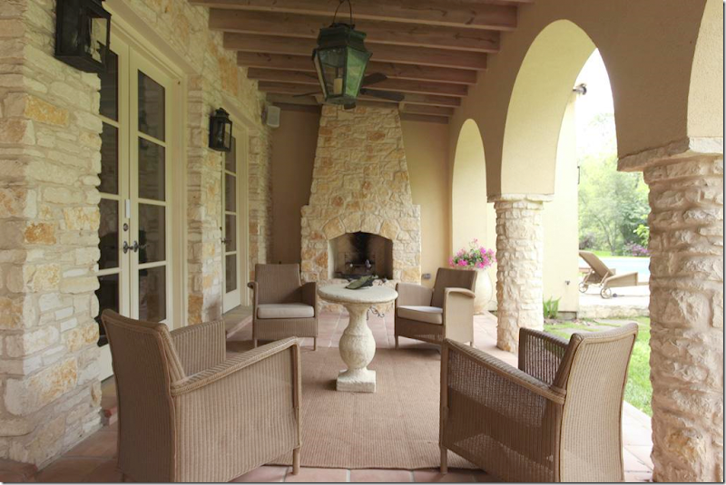
The porch off the family room. There is a floor plan and an itemized account of each room with the HAR listing.
After I saw the HAR listing and thoroughly confused myself, I looked up this story in the old Veranda, from February 2001. Now, the HAR house was built in 2004, so it can’t be the same house. After looking again at the captions of the HAR listing pictures, I noticed something I had missed before: Architect Kirby Mears of Murphy Mears and Interior Designer Carol Glasser. This is the same exact team who were responsible for the Veranda house. What gives? Two similar houses with the same team and mostly the same furniture?
Above, in the 2001 story, is the same mirror found above the bed in the HAR house. The HAR house has matching Swedish styled nightstands, while the Veranda house has smaller, French styled ones, as seen above.
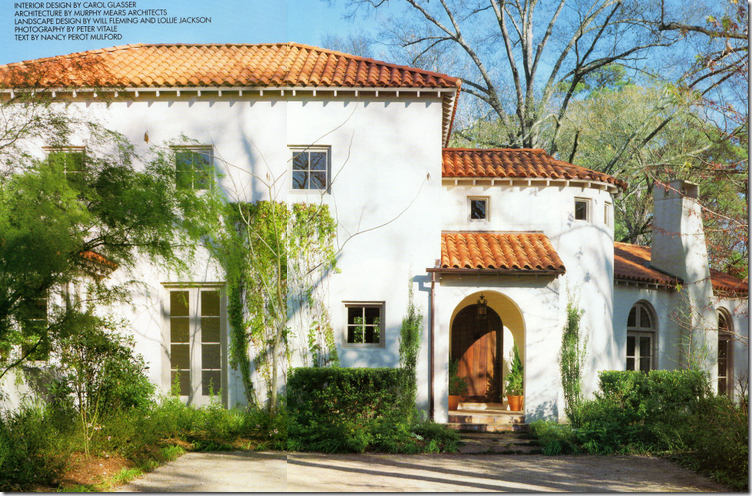
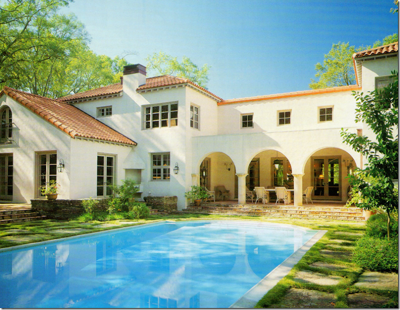
Here is the Veranda house, also located in the same general area as the HAR house, but not the same neighborhood. If you notice, the layout is very similar, with the living room to the right of the front door, looking like it was added on to the house – with its lower roofline. The HAR house has a similar elevation – see below.
Notice the HAR house again – the living room is off to the right of the front door, looking like an addition, with a lower roof line. But, while this house looks Provencal with its stone walls and tiled roof, the Veranda house of 2001 looks more Mediterranean or Spanish with its white stucco façade.
The back of the Veranda house has a similar back covered dining terrace. The swimming pool is sited up against the house as opposed to the HAR house.
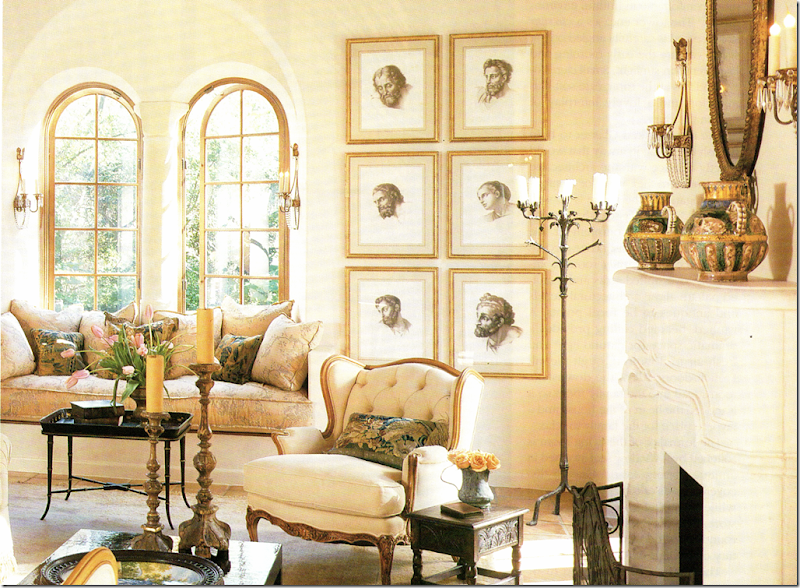
The living room in the Veranda house. Now, here I must confess. For years and years I absolutely loved this house. It was one of my favorites – ever. Now, ten years later, I still feel very attracted to it. It amazes me how current this house looks today – it really could have been designed this year. What a testament to the classic style of Mears and Glasser. Do you notice any similarities in this room to the HAR house? This room is seems smaller and cozier, more romantic I think with its arched windows and creamy fabrics. Notice the framed prints – they are one thing that immediately seemed familiar to me. The window seat is another.
Here’s a close up of the window seat. For years, this seat served as a personal inspiration to me. I loved the thickness of the cushion – something that you usually don’t see that often. Whenever I make a cushion for a client, I always have this exact one in my mind to emulate. I’ve always admired the Niermann Weeks sconces found here and next to the fireplace. And I’ve always loved the pillows Glasser had made out of old Dutch tapestries. I still love to use those today.
And from the landing in the newer HAR house – this has to be the same exact cushion. When I saw this, I was like, huh???? Where have I seen this cushion before?
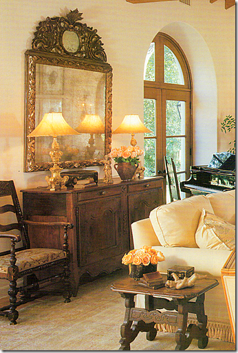
A close up of the Veranda house – I love Carol’s taste – the way she accessorizes, the furniture she picks out for her clients. Notice those lamps – they seem to be same ones as found in the entry hall of the HAR house. And that mirror – it’s the same one over the family room fireplace in the HAR house.
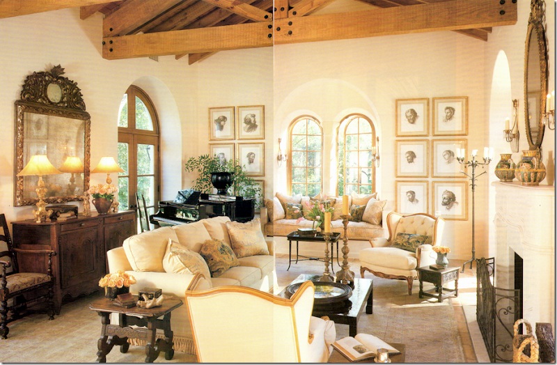
(Forgive the terrible scan!) And to compare the living room – here the Veranda house with the…
The newer HAR house. It might be the same rug, hard to tell. The sofa has different fabric, as do the two French chairs. The chairs next to the fireplace are a new addition. The coffee table is different, but the side table is the same. The same framed prints are here, as are the same four sconces. The chandelier is an beautiful addition. The piano returns, but the French buffet and the mirror are newer and grander. The room seems larger and dressier. Which one do you prefer? The newer HAR or the older Veranda house?
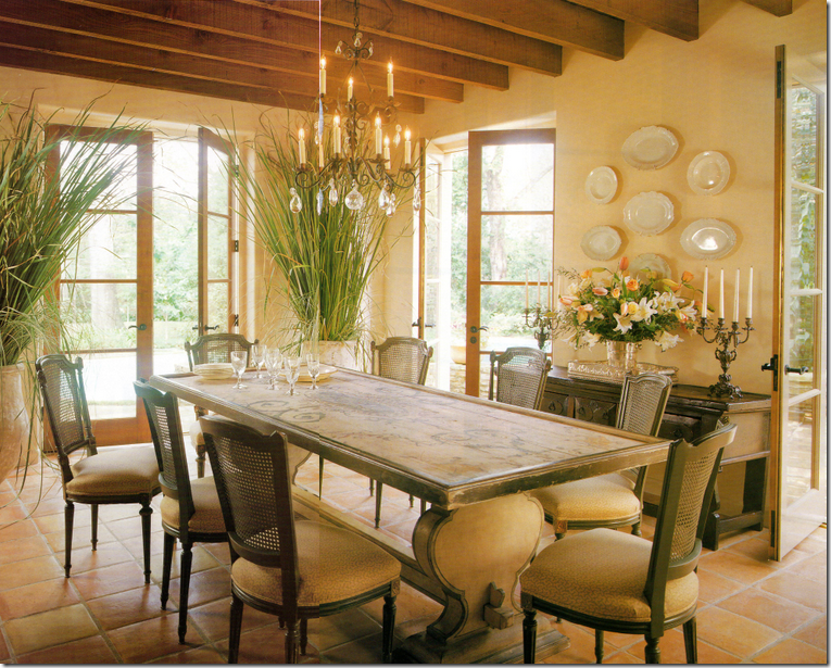
I used to think this was the prettiest dining room I had ever seen! I still love it to this day. At that time, 10 years ago, the painted table was so fresh looking - not many people were using painted pieces like this. Nor were they using biots in the house like this. I adored these chairs. I just loved everything about this room when this Veranda came out.
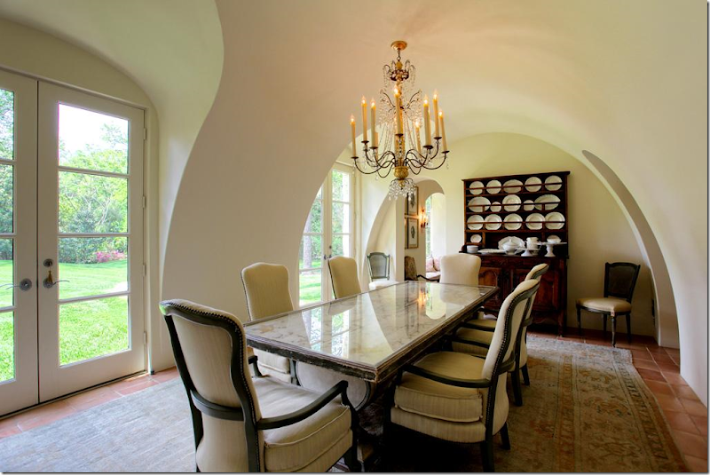
Compare it with the HAR dining room, which is really hard to beat – the architecture is stunning with the arching walls and ceiling. Notice though the table is the same, although a glass top was added. The chairs were changed, but I do see two of the old cane backed chairs in the back of the room. The rug is an addition. Notice that both houses have Saltillo tile. The stunning chandelier is a new addition. Which dining room do you prefer? I have to go with this one!
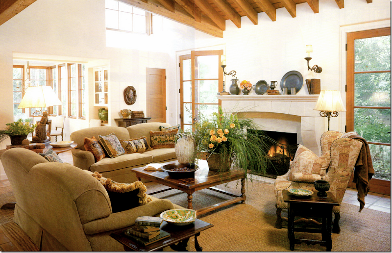
The Veranda family room. This reminds me of the HAR room, just smaller and less expansive. When I saw the HAR house, I noticed the similarity here too. The French chair looks like it ended up in the HAR house playroom.
The furnishings in HAR family room are almost exactly the same with the exception of the two chairs. The pillows were changed out, as were the fabrics, but the beautiful lamps remains. The mirror above the fireplace is the one from the Veranda living room (not seen in this photo.) The gateleg lamp table is different – in the Veranda house it’s a wine tasting table. These colors look cooler here, and warmer in the Veranda house. Again, the HAR house seems larger and more expansive, but I believe the Veranda house is actually a little bit bigger square footage wise.
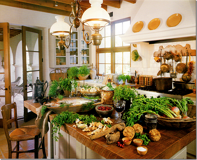
The kitchen in the Veranda house. I will say this – styling has changed in the past ten years. This seems overkill – if styled today, the island would remain clean. The fixture over the island is gone from the HAR house – and good riddance! I just don’t care for it as much as the one in the HAR house.
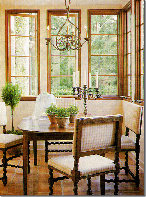
The breakfast room in the Veranda house. Same chairs, different table. This sweet light fixture seems to have ended up in the HAR guest room, along with a few of the caned dining room chairs.
The HAR house: this is so much better with the sofa and the Bennison pillows added. I love this table too. So beautiful
The HAR house with the light fixture from the Veranda breakfast room and a few of the Veranda house dining room chairs.
The upstairs landing in the Veranda house. I used to think this was so gorgeous. Gorgeous! I still love this picture with the trio of round portraits, the ancient bench, the candlesticks. I’ve said it before and I’ll say it again, Carol Glasser has THE most fabulous taste.
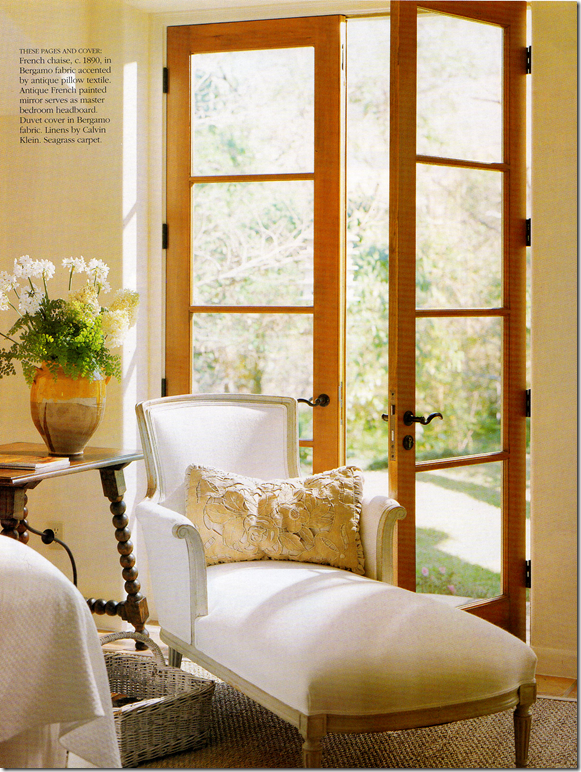
The master bedroom in the Veranda house wasn’t really shown, except for this chaise and the mirror, both found in the HAR house.
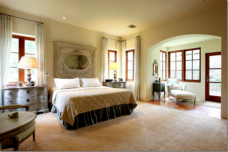
The HAR house: the chaise was pretty in white, but Glasser used all Chelsea Edition fabrics for the HAR house. She added the Swedish styled end tables with wood lamps. And the headboard mirror – the one on the Veranda cover - remains the same. The mirror first caught my attention that something about the HAR house was very familiar.
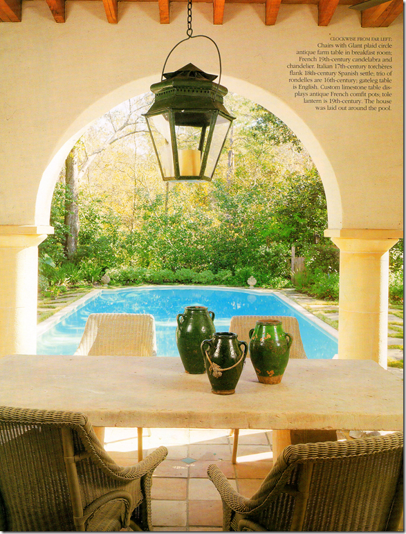
And finally, the Veranda house – terrace. It looks like the same chairs were used.
Now, I have NO idea who owns the HAR or the Veranda house. I have a feeling it’s the same couple. And I have a hunch why they might have moved and built a somewhat similar house, using the same team. The property in the HAR is stunning – it’s huge and secluded and quiet. The Veranda house is also very secluded and wooden, but hiding nearby behind all the trees on the Veranda property – is a very nearby freeway. It’s just a total guess that the couple was seeking quiet and more seclusion when they moved. I don’t know this for sure, but I’ll wager many in Houston do know and someone will probably email me or leave a comment explaining it all. I really don’t care to know the specifics. What does interest me is I think it’s fascinating to see how two houses designed by the same architect and interior designer resemble each other – and how different they are, at the same time! I love seeing how the furnishings were changed with new fabrics and accessories – like new chandeliers and rugs – to make it all look different, yet retain its original beauty. I loved comparing each house and each room – to see what was kept, what was changed, what was added. Kirby Mears, the architect, is becoming a real favorite of mine. It seems that every time there’s a great house – it has his stamp on it. And I don’t have to say how much I admire Carol Glasser. She’s a master – each piece is hand picked for the client, slowly and over time. There isn’t a rush to buy everything at once – she waits for the perfect piece for the perfect spot, and it shows.
I hope you enjoyed this look at these two houses, as much as I did!!!
To see the HAR house listing, go HERE.
To visit Murphy Mears web site, go HERE.
Remember Houstonians, the Urban Market is today and tomorrow – Saturday and Sunday! Courtney Barton, will be there at Sally Wheat’s booth with goodies and a line of fabrics she bought in India that are sold exclusively in France!!! It sounds fabulous.
